+34% registrations. Rebuilding investor trust in data.
A full platform refactor focused on rebuilding investor trust through data clarity, reducing friction, and reactivating disengaged users.
Overview
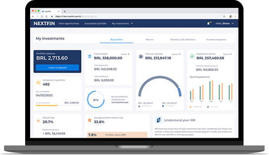
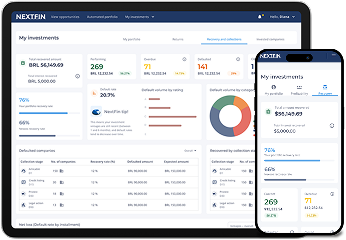
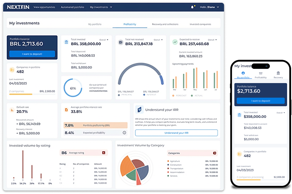
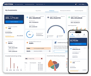
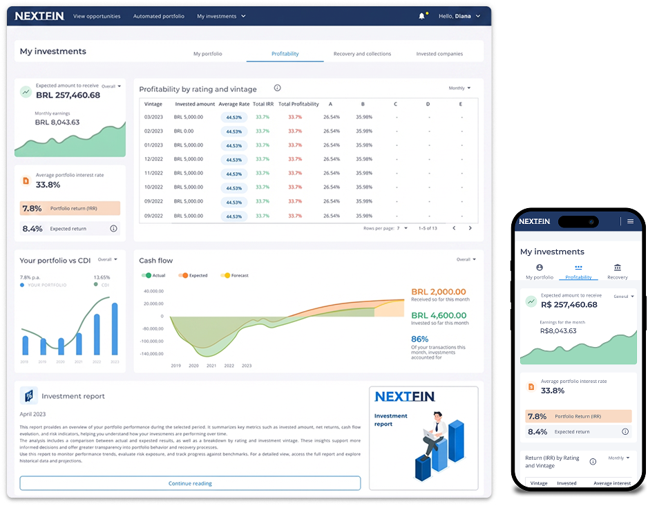
Refactor of an existing P2P investment platform to improve trust, clarity, and usability across critical investor dashboards.
🎯 Goal: expand customer base, reduce churn, and rebuild confidence in how values are derived (without adding new features first).
Scope centered on the main decision-making touchpoints used for portfolio monitoring and investor actions.
Problem statements
Investors and prospects were losing trust due to calculation uncertainty and data interpretation issues, impacting brand perception.
This translated into dissatisfaction, lower engagement, and weaker confidence in investment "health" and predictability.
The product needed clearer data logic and trust signals, not just visually, but in how values were derived and communicated.
Strategy
- Trust before features: prioritize clarity and reliability over adding new functionality.
- Use research + structured alignment to define a shared data hierarchy and validate it with users and engineering.
- Design for a moderate investor mental model, precise enough for aggressive profiles, clear enough for conservative ones.
*For GDPR reasons,
some data has been hidden.
My role
Led UX and Product Design end-to-end : as the primary designer on the project, from problem framing to final delivery. Worked within a cross-functional team. When the Design Lead left mid-project, I took over direct stakeholder defense with the Tech Director and senior business stakeholders, from design rationale to scope negotiation
Key decisions & Trade-offs
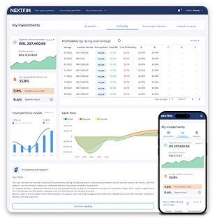
Designed for at-a-glance clarity in how key values are derived.
Trust before features
Prioritized clarity in calculations and data interpretation before expanding functionality.
Trade-off: delayed new features to reduce misinterpretation and churn risk.
Navigation split by user intent
Consolidated each dashboard around one primary job-to-be-done, reducing competing data and protecting decision confidence.
Trade-off: de-scoped lower-impact content to protect scanability and decision confidence.
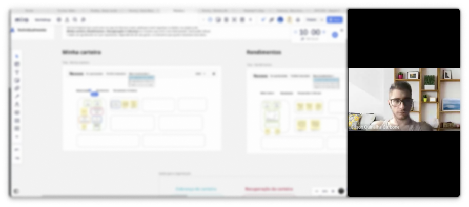
Low-fi validation before UI polish
Validated structure and key actions early, then iterated based on findings before visual polish.
Trade-off: less visual fidelity upfront, fewer late-stage changes later.
Hierarchy under constraint
Designed mobile-first across all dashboards, then scaled to desktop. Standardized patterns via the design system to reduce competing data on screen.
Trade-off: limited customization and deprioritized secondary details to improve clarity, predictability, and cross-viewport consistency.
What Changed
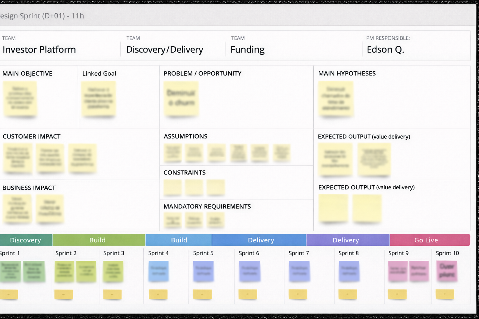
- Phase 1 (Structure + Trust Signals): define data hierarchy, flows, and dashboard composition; align with engineering on calculation logic and data gaps.
- Phase 2 (Validation + Refinement): usability testing surfaced confusion; we simplified groupings, clarified primary vs. secondary values, and removed/deferred low-impact information.

Evidence & Results
What were our outcomes in production:
Post-release outcomes
+34%
registrations
+21%
reactivation of investors inactive for over two years.
🧭 Signal:
Monitoring focused on acquisition/active users, retention/churn, time on platform, support ticket volume, and signup time (directional evaluation).
Qualitative signal
123
responses
collected
72
investors reported improved confidence in navigation and data visualization
72 of 123 investors (58%) reported improved confidence in navigation and data visualization
“Much easier to navigate, and the visualization has improved.” - Investor 1
🧭 Signal:
- Easier navigation.
- Clearer data visualization.
- Improved confidence when interpreting financial information.
What changed structurally
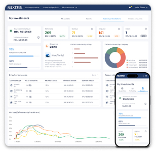
🔀 Dashboards were redesigned to separate confirmed vs. projected vs. expected values, reducing misinterpretation risk.
🔒 A risk/compliance blocking alert was added to prevent investment actions without a completed risk profile.
📈 System behavior was standardized through design system usage to improve predictability and scalability.
📐 Design system adoption standardized component usage across all Nexoos products → -91% front-end development time.
Next Steps
Now (0–4 weeks) → Next (1–2 months) → Later (quarter+)
🧩 Refine edge cases and secondary flows excluded from early validation to keep focus on core understanding. (Now)
🔍 Add progressive disclosure for advanced risk/performance explanations without increasing cognitive load. (Next)
📊 Continue monitoring retention/reactivation patterns to validate long-term trust and usage consistency. (Later)